Oleg I.
Web Designer
Web Designer
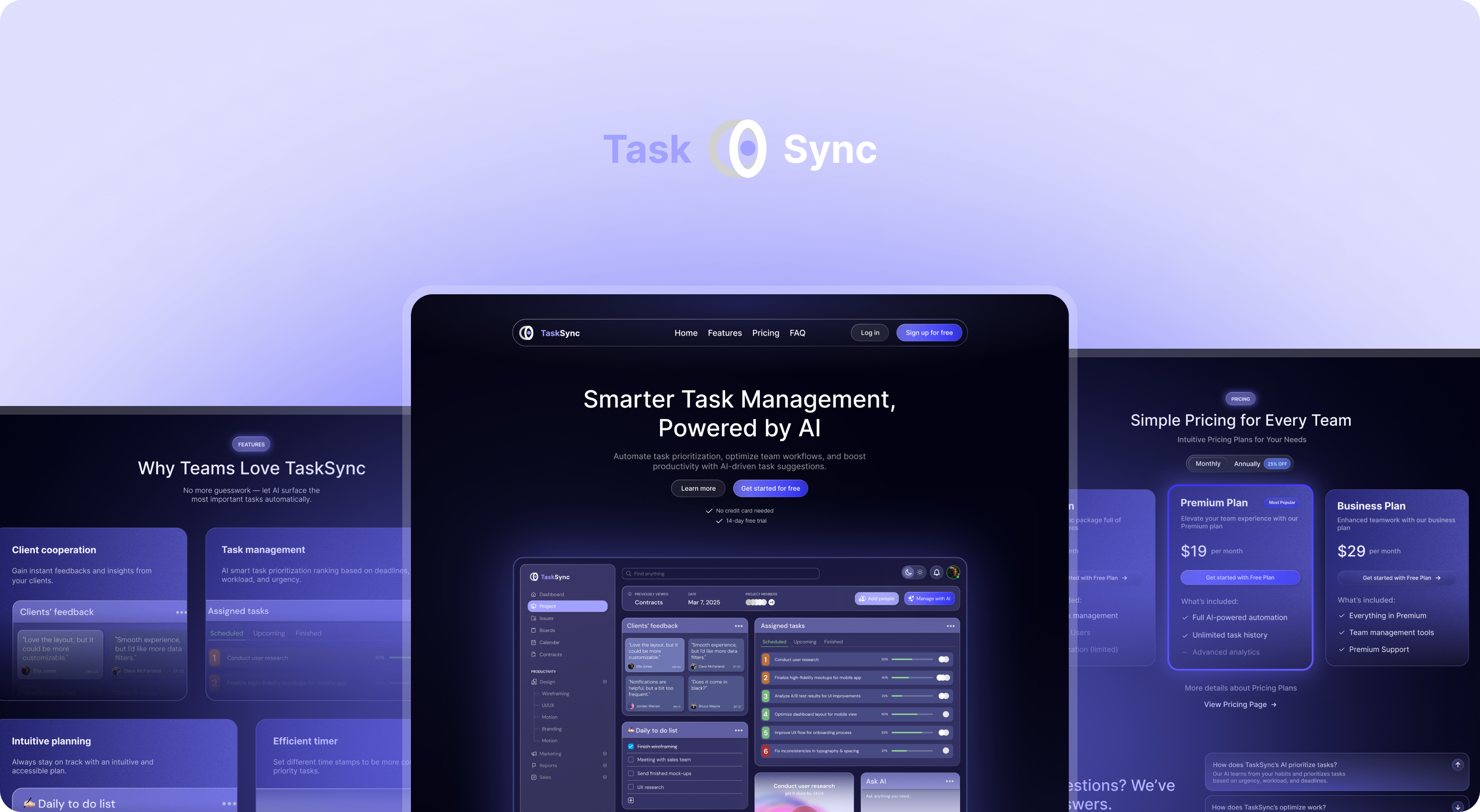
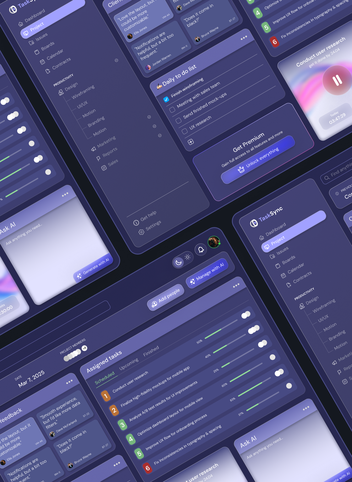
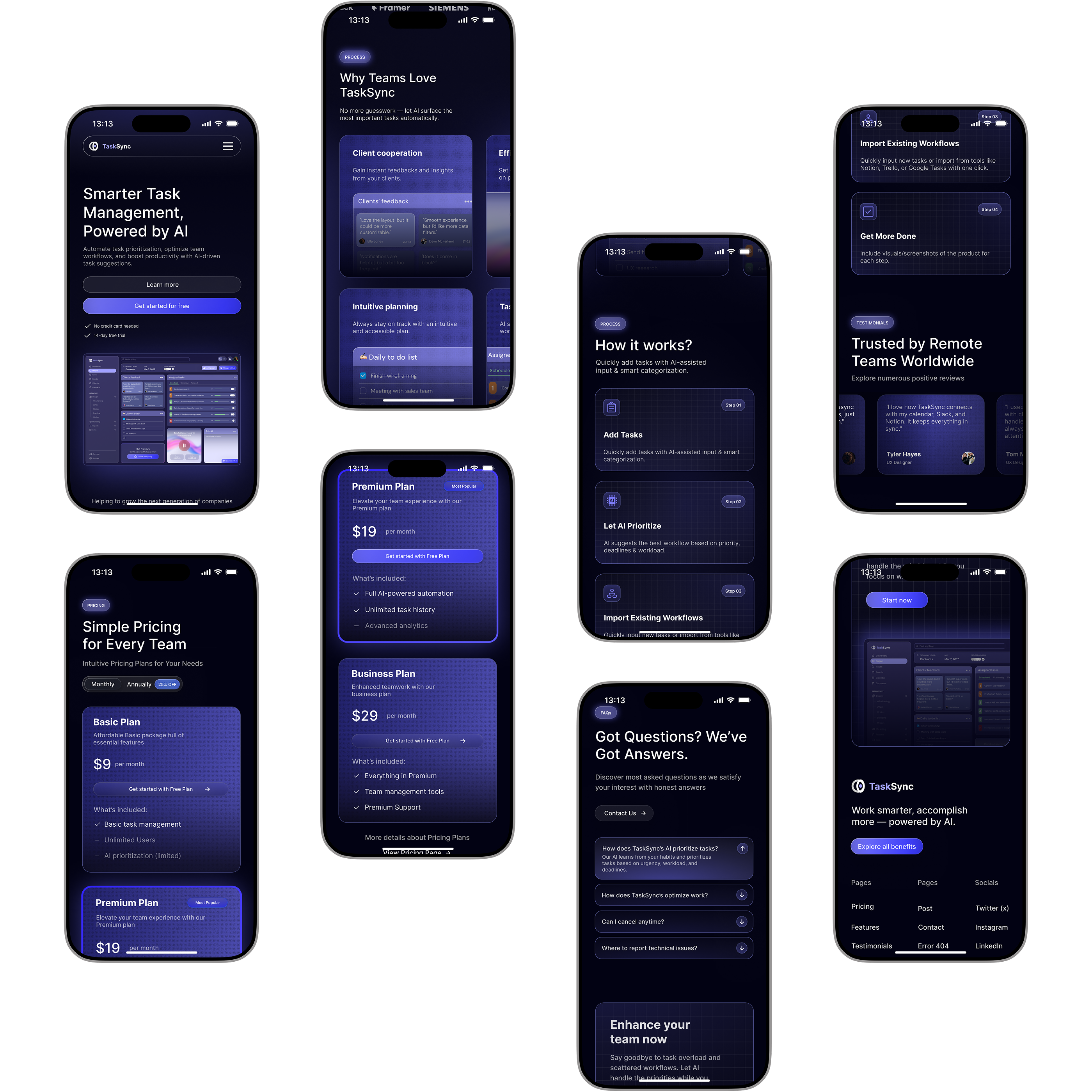
TaskSync is a conceptual task management platform designed to simplify collaboration and streamline productivity for individuals and teams. Built with a focus on AI-powered assistance and minimal friction, TaskSync aims to bring smart, intuitive design into everyday task workflows.
This personal project includes a full UI/UX design system, web dashboard, and mobile landing page. It showcases my ability to think in systems, prioritize user goals, and balance clean aesthetics with functional depth.
While there are countless task management tools in the market, many suffer from complexity, clutter, and feature overload. This leads to lower engagement and slower onboarding — especially for teams that value clarity and speed.
Too many tools try to be everything at once — leading to bloated dashboards that overwhelm users instead of creating a user-friendly experience.
EXAMPLE
Users are presented with excessive options upfront, forcing them to dig through menus and sidebars to perform basic actions.
IMPACT
Users feel cognitive fatigue and are less likely to stick with the product long-term.
Task managers often leave users to manually sort or assign priorities, which adds effort rather than removing it.
EXAMPLE
Important tasks can get buried beneath low-priority items unless users actively manage visibility.
IMPACT
Critical tasks may be missed, and teams lose efficiency in identifying daily action items.
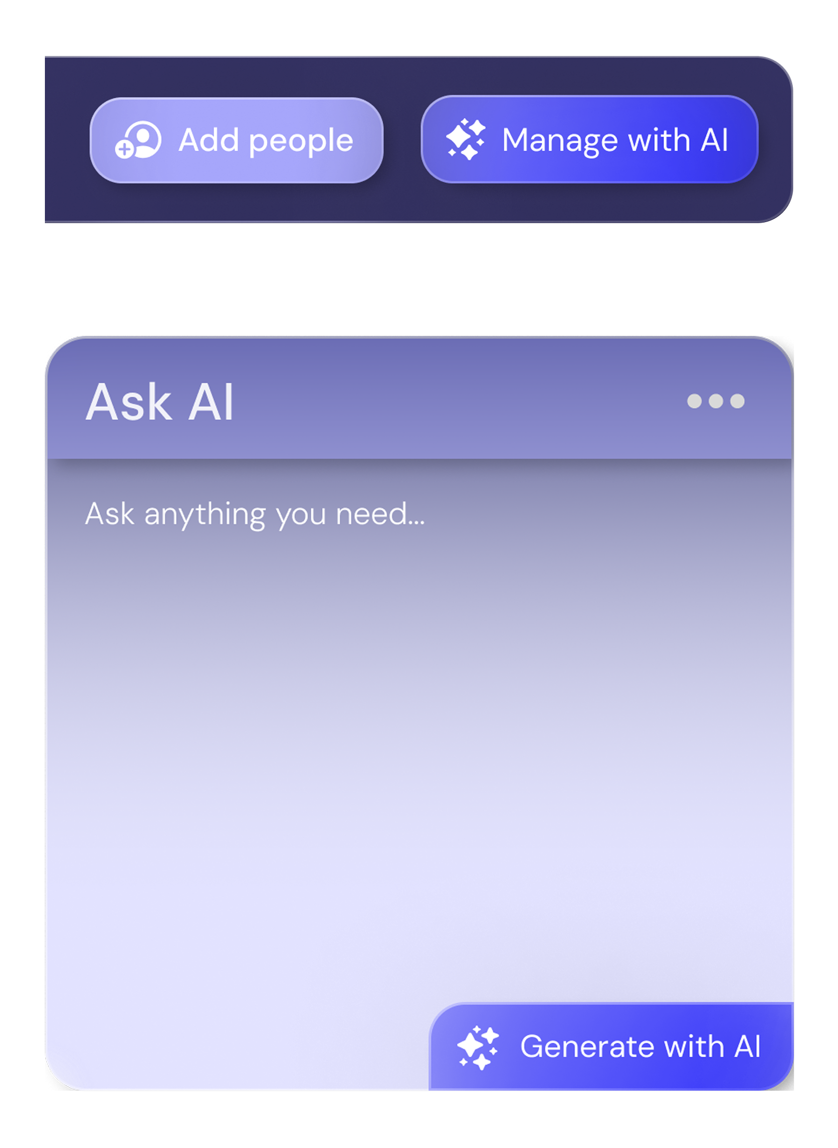
AI features are often introduced as gimmicks or loud automations, creating distractions rather than value.
EXAMPLE
AI nudges that constantly pop up or make decisions on behalf of the user without context.
IMPACT
Distrust and disengagement from "smart" features that are supposed to help.
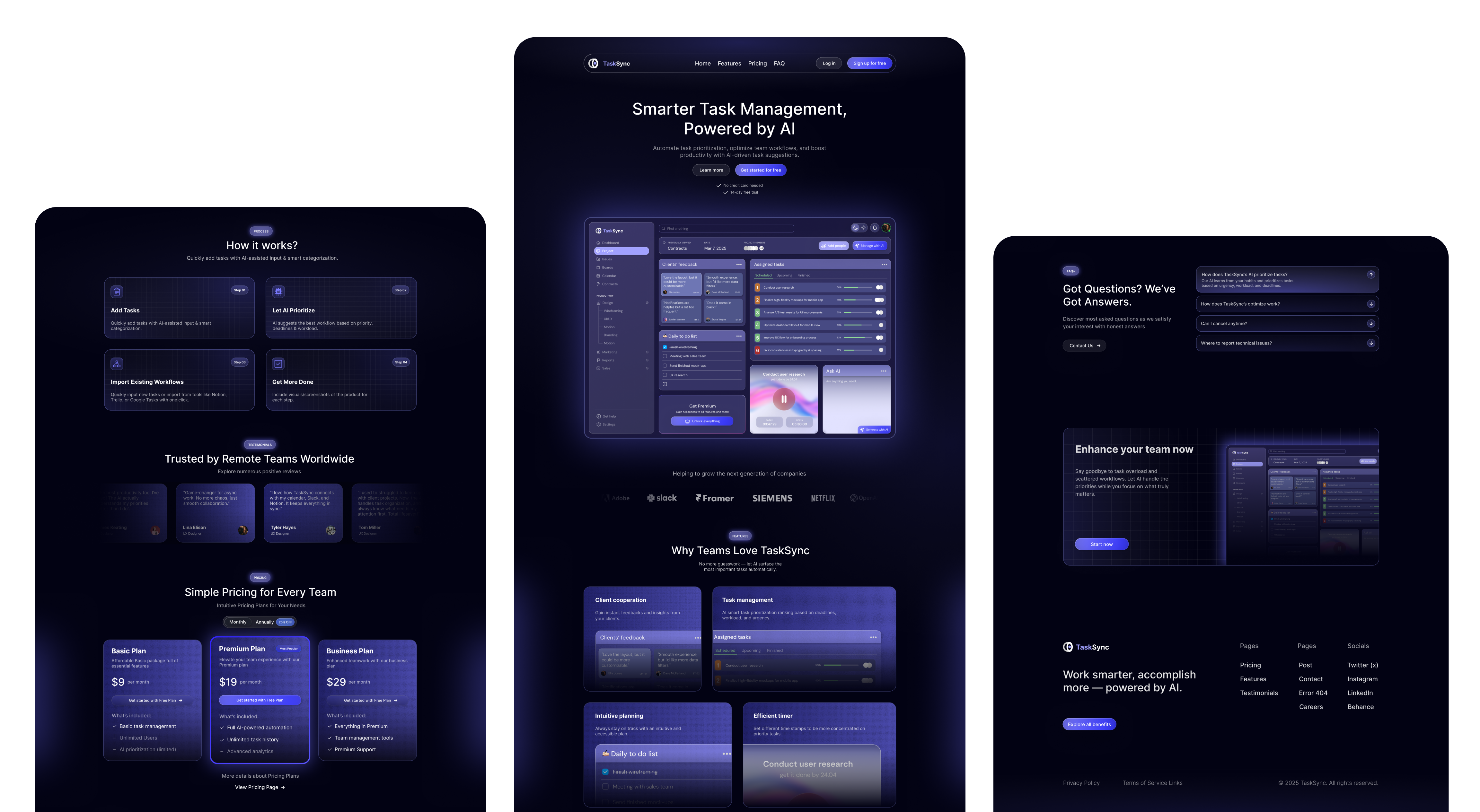
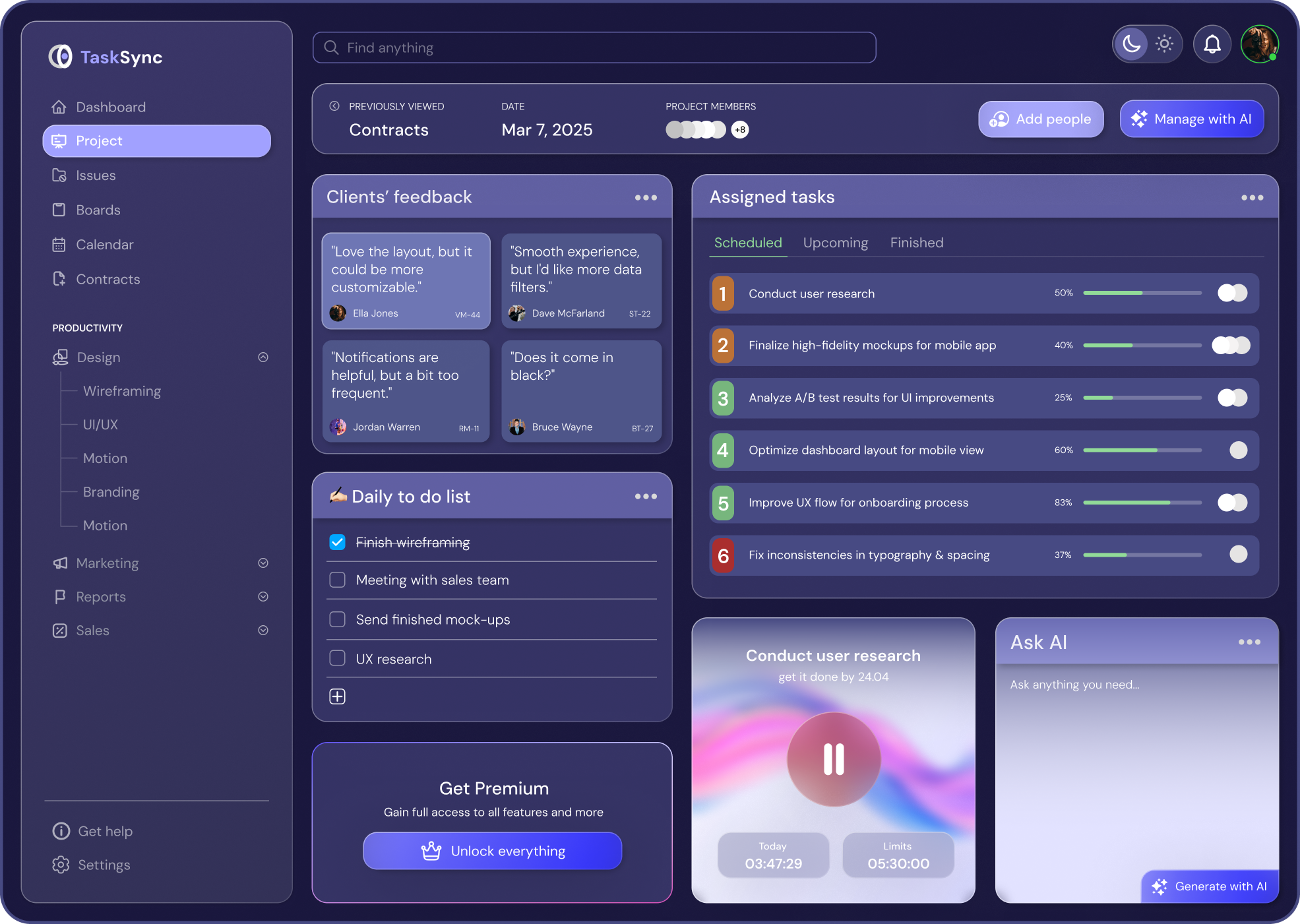
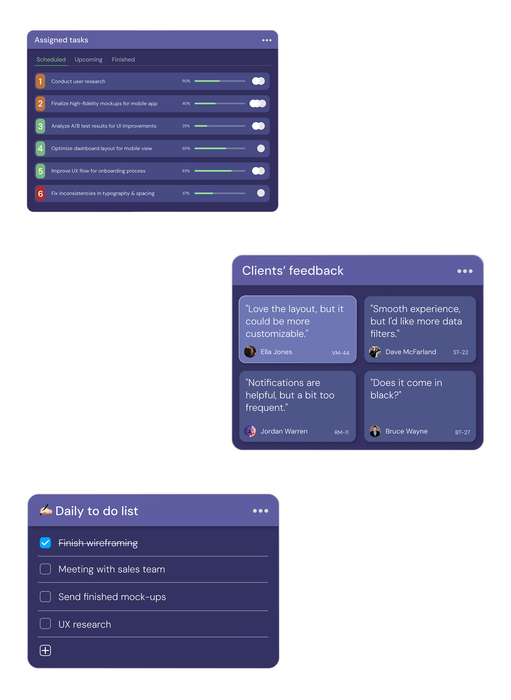
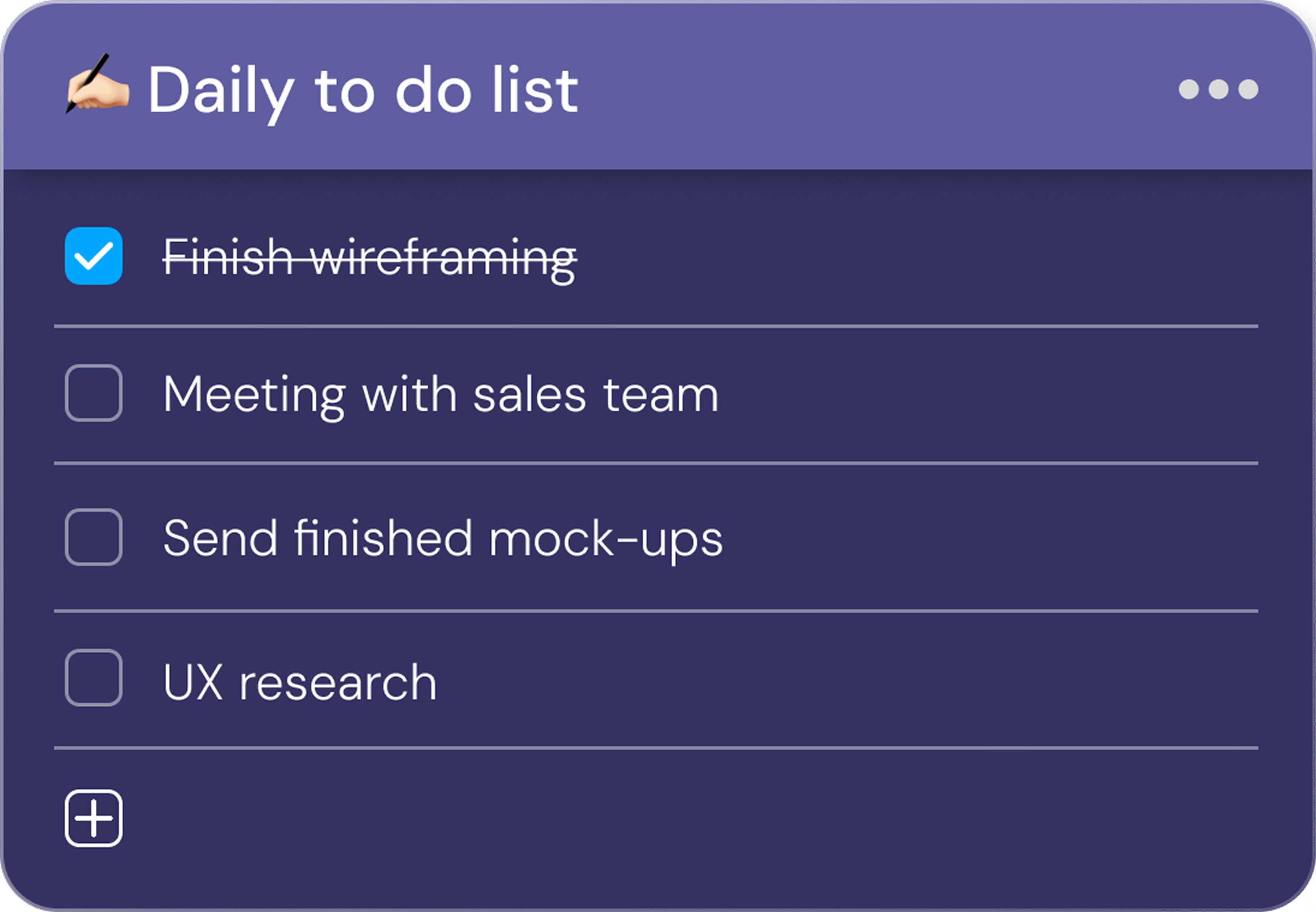
Highlights important tasks at a glance — no digging required.
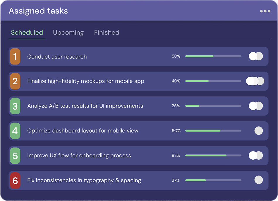
Keeps focus on actionable, time-sensitive goals.
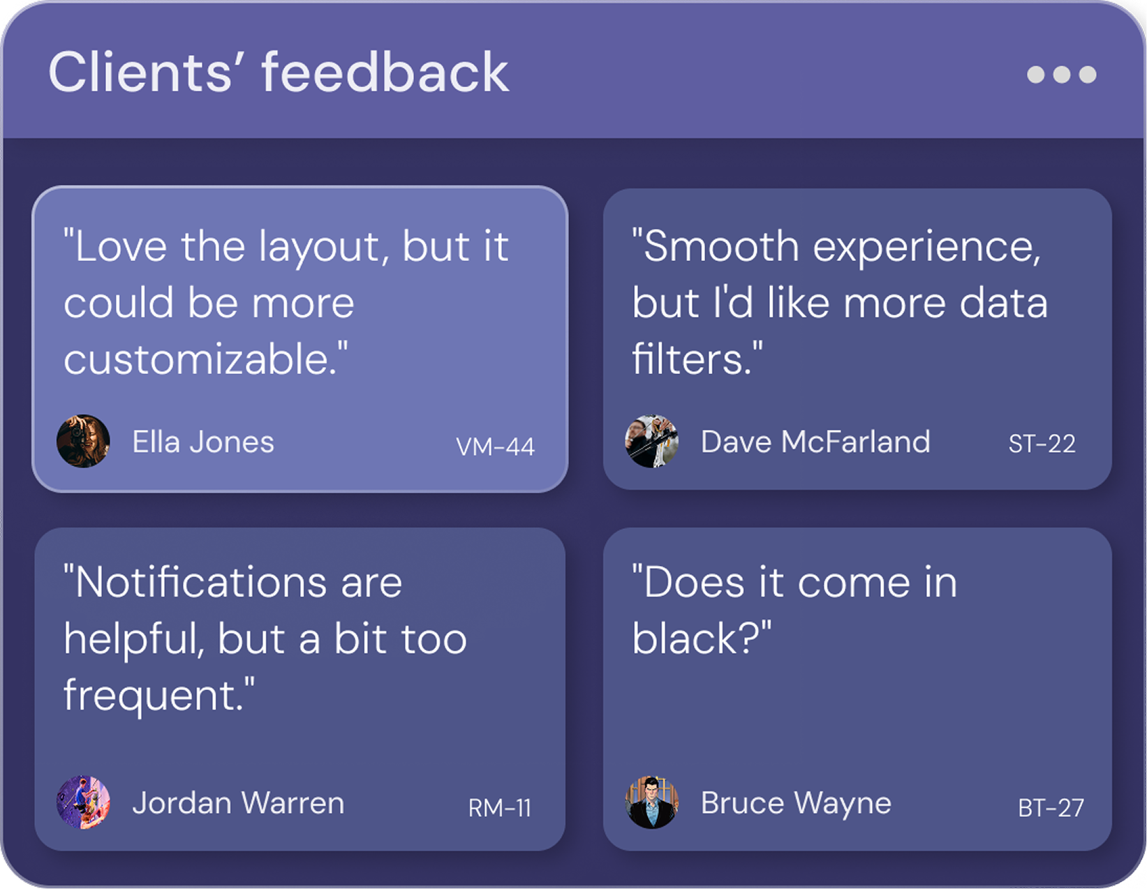
Supports collaborative feedback cycles within task threads, allowing teams and clients to exchange ideas, clarify expectations, and iterate efficiently.
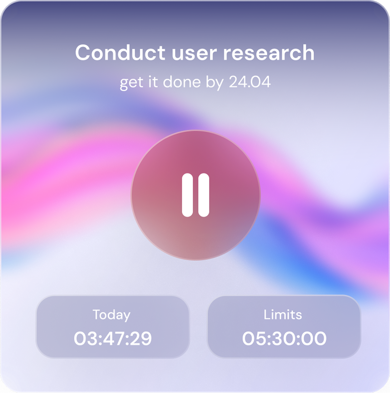
Encourages deep work with optional Pomodoro-style timeboxing.
#FFFFFF
RGB: 255 255 255
#A1A1FF
RGB: 161 161 255
#6E76B4
RGB: 110 118 180
#6D6DFC
RGB: 109 109 252
#474A83
RGB: 71 74 131
#1010FF
RGB: 16 16 255
#020213
RGB: 2 2 19
#1A173E
RGB: 26 23 62
I chose the Inter font for its modern, clean, and highly readable design. Its geometric yet friendly letterforms make it ideal for digital interfaces, ensuring clarity and ease of reading across all screen sizes. With excellent kerning and well-balanced spacing, Inter enhances both aesthetics and functionality, giving design a professional yet approachable feel.
A a B b C c D d E e F f G g H h I i J j K k L l M m N n O o P p Q q R r S s T t U u V v W w X x Y y Z z
A a B b C c D d E e F f G g H h I i J j K k L l M m N n O o P p Q q R r S s T t U u V v W w X x Y y Z z
A a B b C c D d E e F f G g H h I i J j K k L l M m N n O o P p Q q R r S s T t U u V v W w X x Y y Z z
Ready to transform your digital product? Let's discuss how I can help bring your vision to life.
Let's talk